The background is the second most important thing in a jewelry photo, after the light. It decides whether a white gold ring has an outline, whether a diamond looks bright or grey, and whether a customer scrolling a grid of thumbnails sees a store or a garage sale. It is also the thing most catalogs get wrong, not by picking the wrong color but by picking five of them.
Here is how each background behaves with jewelry, which pieces it suits, and the one rule that matters more than any of it.
White
White is the default because marketplaces asked for it. Amazon requires it for main images. eBay says it is generally best. Google Shopping likes a plain background. For a seller on those channels, a white main image is simply the rule.
For jewelry it has real problems. White metal and diamonds lose their edges against pure white, so a white gold band becomes a grey smudge. Cameras see all that white and underexpose, which makes the piece dark. And a white background with no shadow leaves the piece floating like a cut-out.
- Suits: yellow and rose gold, colored stones, pieces with strong outlines, anything that must meet a marketplace rule.
- Fix the floating: keep a soft shadow under the piece, or shoot on a white surface rather than cutting the piece out.
- Expose for the piece, not the background. Let the white go slightly grey if you have to.
Cool light grey
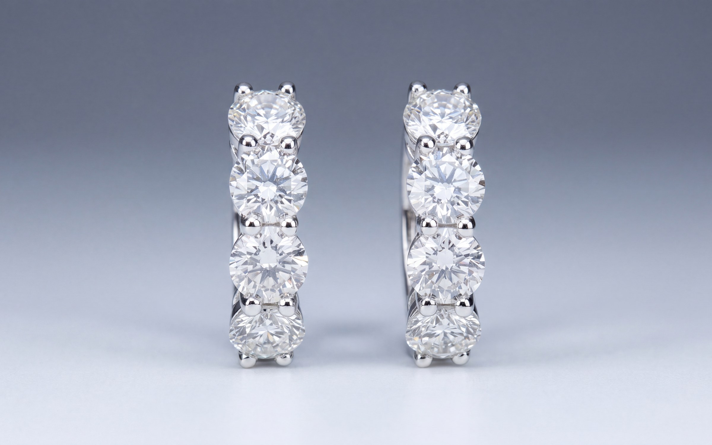
A cool grey, somewhere between a light pencil and a pale slate, is the background we standardized on for our own catalog and the one we recommend for most stores. It gives white metal an outline, it keeps diamonds bright without glare, it makes yellow gold look warm instead of orange, and it photographs the same on Monday and on Friday. With a soft shadow underneath, the piece sits on a surface instead of floating. On a shop grid or in Google's product listings it still reads as clean and professional.
- Suits: nearly everything. It is the safest single choice for a mixed catalog of white, yellow and rose metals.
- Keep it cool, not warm. A warm cream or beige makes white gold look like it has been plated and makes diamonds look yellow.
- Match it on every piece. Grey only works as a system.
Black
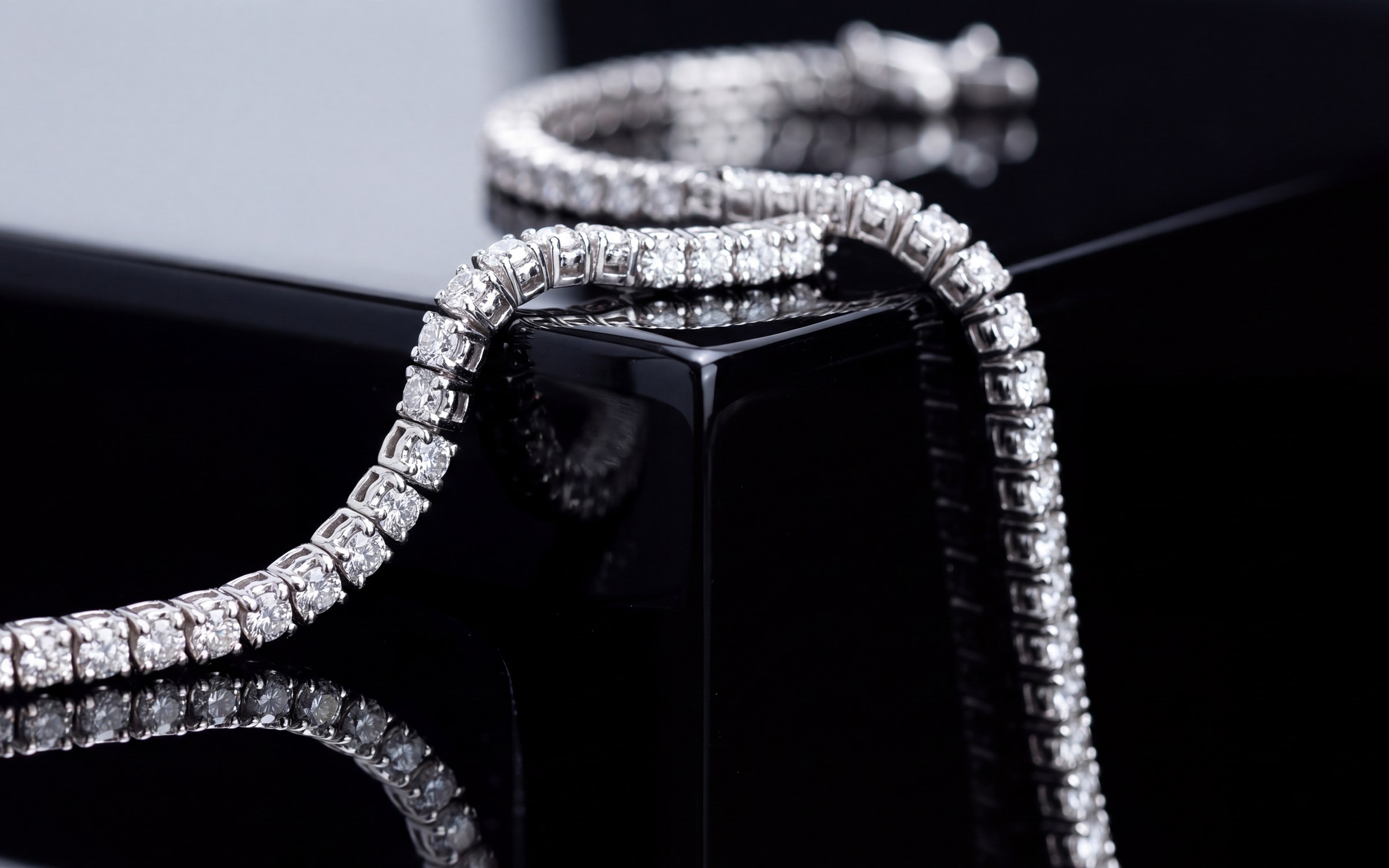
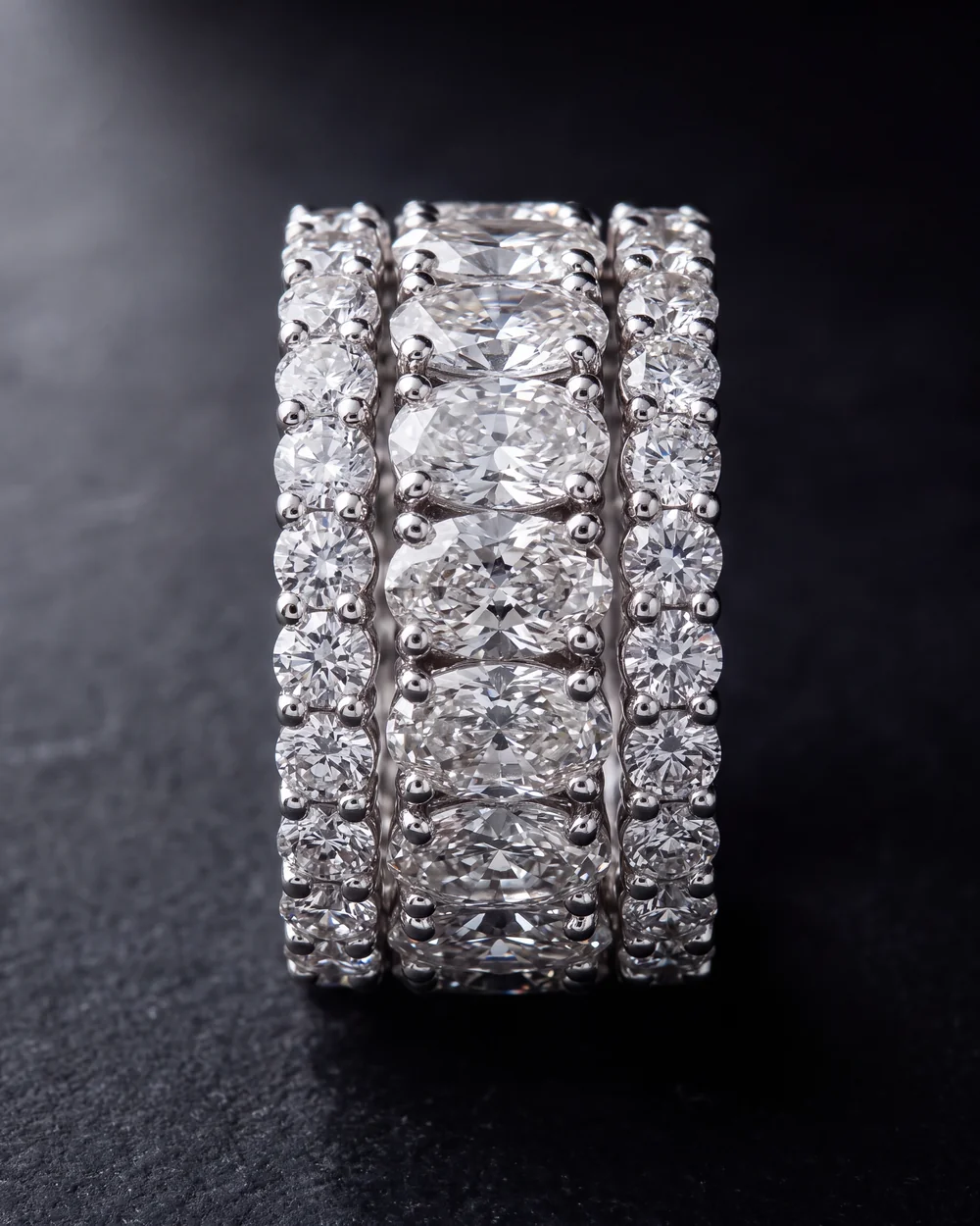
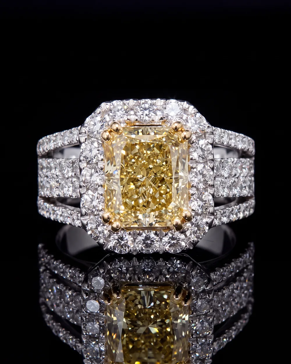
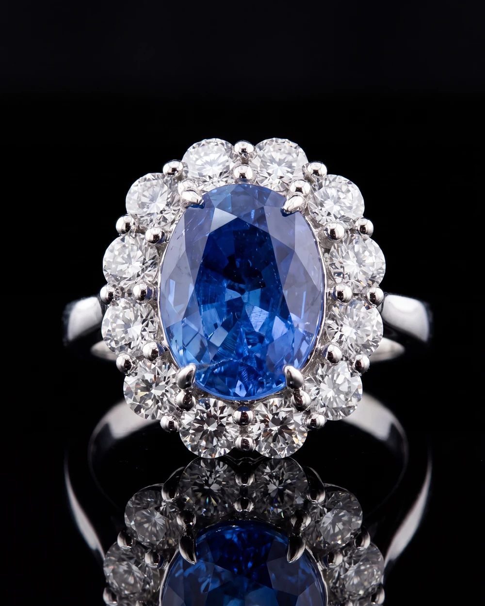
Black is drama. Colored stones and diamonds light up against it, and a single hard light on a ring on black lacquer with a soft reflection looks like a high-end campaign. It is the right main image for a showpiece, a yellow diamond, a tanzanite, a big sapphire.
It is the wrong main image for most of the catalog. The outline of white metal vanishes, a white gold shank becomes invisible, and a grid of black tiles is heavy. Use it for the hero piece, keep a grey or white shot in the same listing for the detail, and do not mix black mains into a grey catalog.
Stone, marble, silk and other surfaces
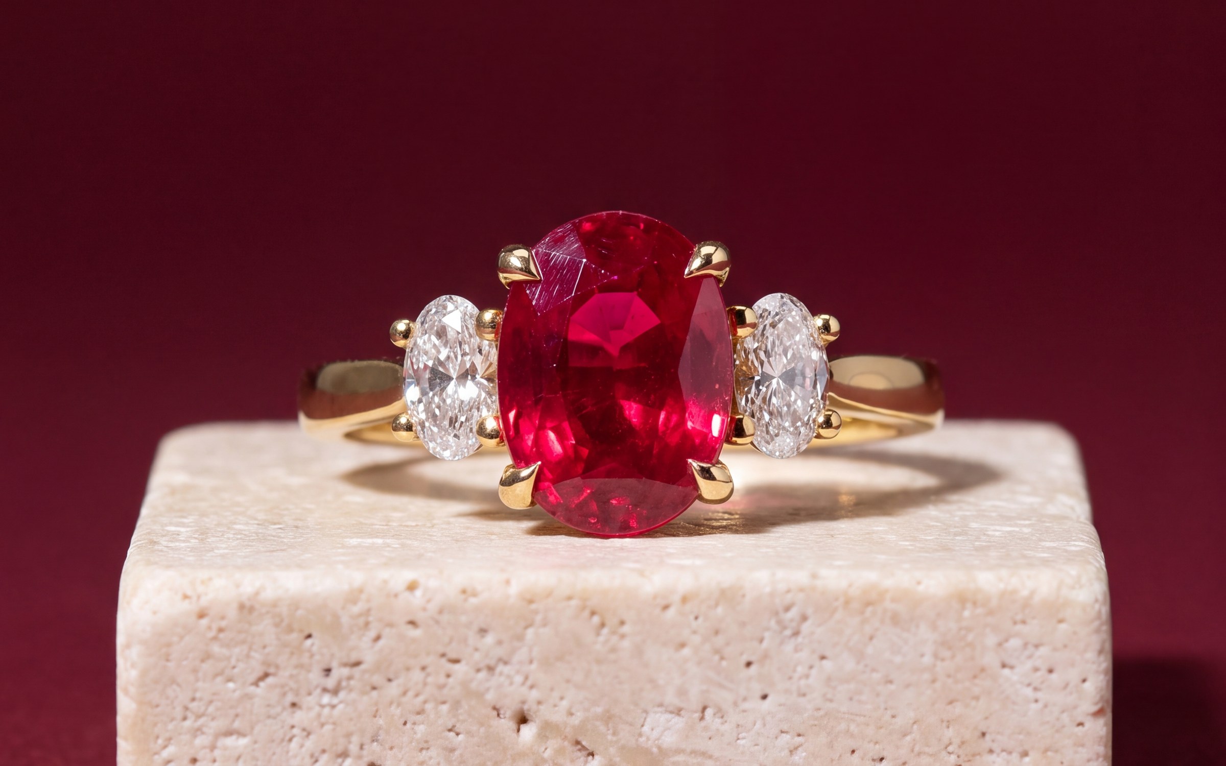
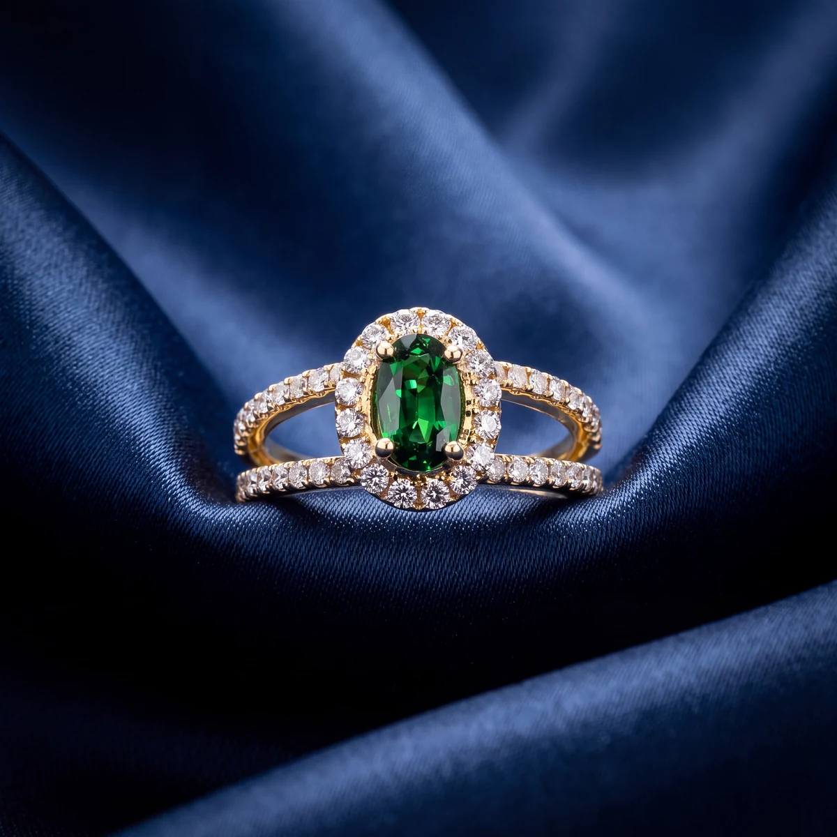
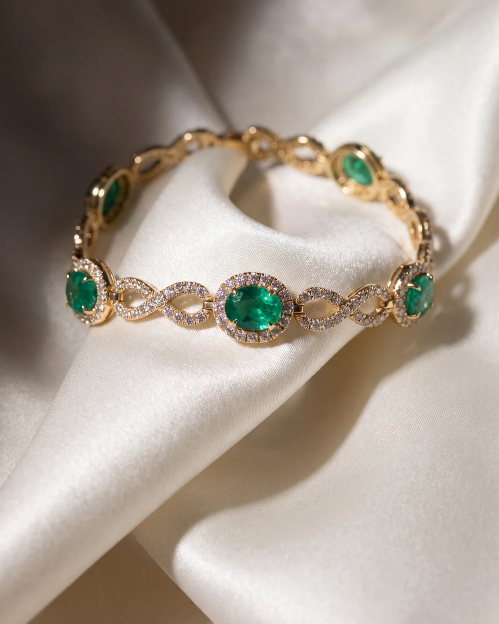
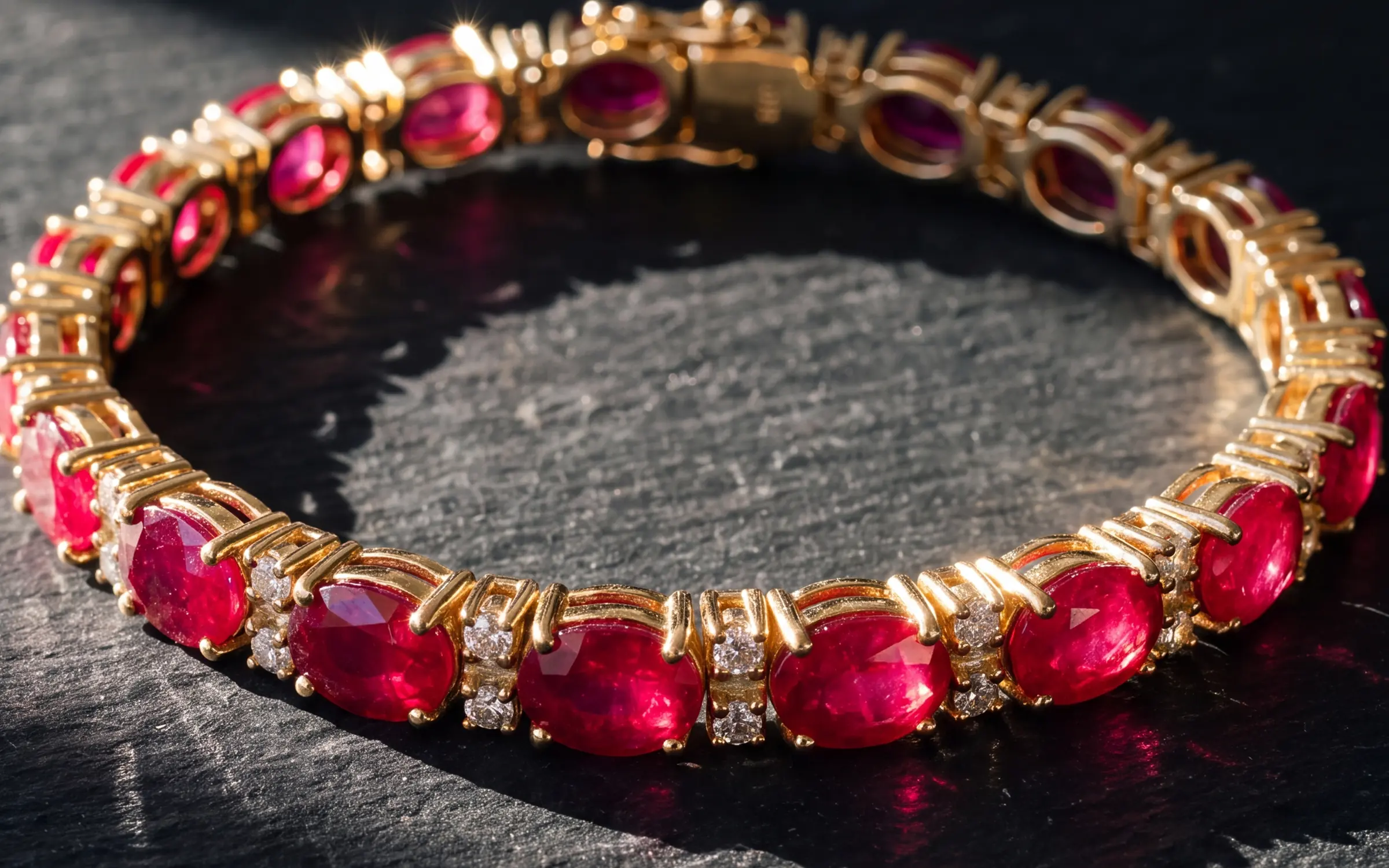
Travertine, slate, marble, linen and silk give you an editorial look without a model. They work when the surface is quieter than the piece: a matte limestone block under a ruby ring, a dark slate under a yellow gold bracelet, a soft blue silk under a green stone. They fail when the surface is louder than the piece, which happens with strong veining in marble, glossy fabric, and anything with a color close to the stone.
- One surface per shot, and keep the texture soft and out of focus where it is not under the piece.
- Match the surface to the metal: cool stone for white metal, warm stone for yellow gold.
- Use them for the second or third photo, or for social, email and lookbooks, where the goal is mood rather than a thumbnail that competes in a grid.
Worn and lifestyle
A piece on a hand, ear, neck or wrist is the photo that answers the question every shopper has, which is how big is it on me. It is the strongest second photo you can add, and many store themes show the second image when a shopper hovers over the product.
As a main photo it usually loses to a clean catalog shot. The piece is smaller in the frame, the skin and the scene take attention, and the thumbnail gets busy. Lead with the catalog shot and follow with the worn shot. If you shoot worn photos yourself, keep nails plain and clean, skin tones true, and the piece in the sharpest part of the frame. A worn shot that changes the metal color or shows a stone from the wrong angle costs you more than no worn shot.
The consistency rule
Every background above works. None of them work mixed. A collection page with a white ring, a black ring, a ring on marble and a ring on a hand looks like four stores. A collection page with every ring on the same cool grey, in the same light, at the same size, looks like one store that knows what it is doing, even if the photos are not individually perfect.
So the choice is really: pick one catalog background for every main image, pick one worn look for every second image, and use the editorial surfaces for the third image, social and email. Then hold the line. If a new piece comes in and you cannot shoot it to the standard, it is better to wait a day than to put a different background in the grid.
Getting every piece onto one background
The reason most catalogs are mixed is not taste. It is that the photos came from five sources over five years: supplier images, a photographer who has since moved on, snapshots, a phone, a scan. Reshooting all of it is the expensive route. Our guide to jewelry product photography pricing covers what that runs.
Aurix takes the photos you already have, whatever background they were on, and makes photos of the same piece on a consistent surface: a cool grey catalog shot, a stone or silk editorial, or the piece worn. The stone, metal color and setting are held to your original and each result waits for your review. Stores publish approved results to Shopify or Wix. Etsy and eBay sellers download them and add them to listings. For the shooting side, see how to photograph jewelry for listings.
Try it on your own photos
Try 10 photos free, no card needed, at app.getaurix.ai. After that, plans start at $99 a month: Starter $99, Growth $199 and Scale $399, month to month. If you'd rather see it first, book a 20-minute walkthrough. We run it on sample pieces.
Questions jewelers ask
What is the best background for jewelry photography?
For a catalog, a cool light grey with a soft grounded shadow. It shows white metal, yellow gold and diamonds without glare, it stays consistent across hundreds of pieces, and it still looks clean on marketplaces and in Google Shopping. Use white where a marketplace requires it, and lifestyle or worn scenes as the second and third photos.
Should jewelry photos have a white background?
Only if the channel asks for it or your whole catalog is already white. Pure white makes white gold and diamonds disappear at the edges and pushes cameras to underexpose the piece. A light grey reads as clean to the customer and keeps the piece visible.
Is black a good background for jewelry?
For a dramatic main photo on a high-ticket piece, yes. Diamonds and colored stones pop on black. But black hides the outline of white metal, so a ring in white gold loses its shank, and it only works if the whole collection is shot that way. Keep a grey or white shot in the same listing.
Do lifestyle photos sell more jewelry?
As a second photo, yes. A worn shot answers the size question and many themes show it on hover. As the main photo it usually loses to a clean catalog shot, because the piece is smaller in the frame and the scene competes with it.
Can Aurix put my piece on a different background?
Yes. Aurix takes your photo of the piece and makes photos of it on a studio surface, stone, silk or worn on a model, keeping the stone, metal color and setting as they are. Each result waits for your review next to the original.